Karl Mårtens

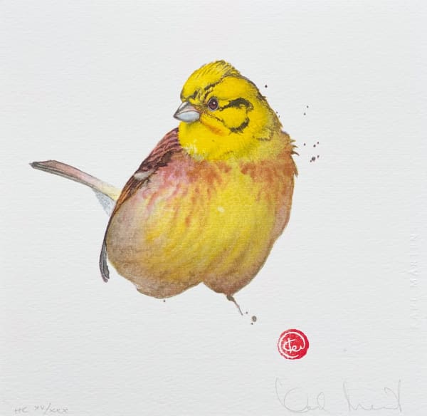
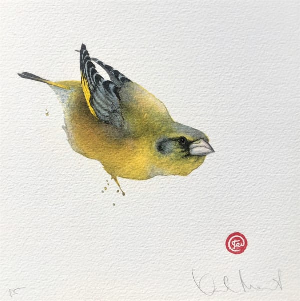
My lithographs are not “reproductions” of my paintings. Each image is created especially for a specific lithographic edition, without any original image as model. The printed result becomes an original - but as an edition. I also want to use the lithography medium as a point of departure for the image, just as I use the watercolour medium as a point of departure for my paintings.
For a lithographic print, I need to plan every colour shift before it’s printed, slowly and consciously building a harmony of all the colours - often the image has to pass through the press ten to twelve times - at times even more, before all nuances and colour transitions harmonise. It requires strict precision and a profound knowledge of how printed colours interact (here I also receive help from the printer). Needless to say, the element of surprise does not come from the unplanned, rapid execution as it does with the watercolour medium. So how can one find the unexpected in this detailed and elaborate process?
The image
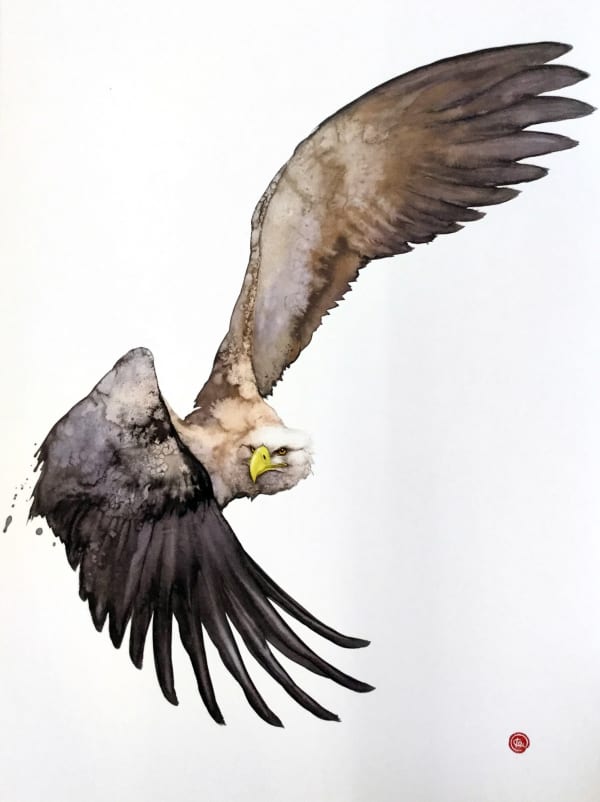
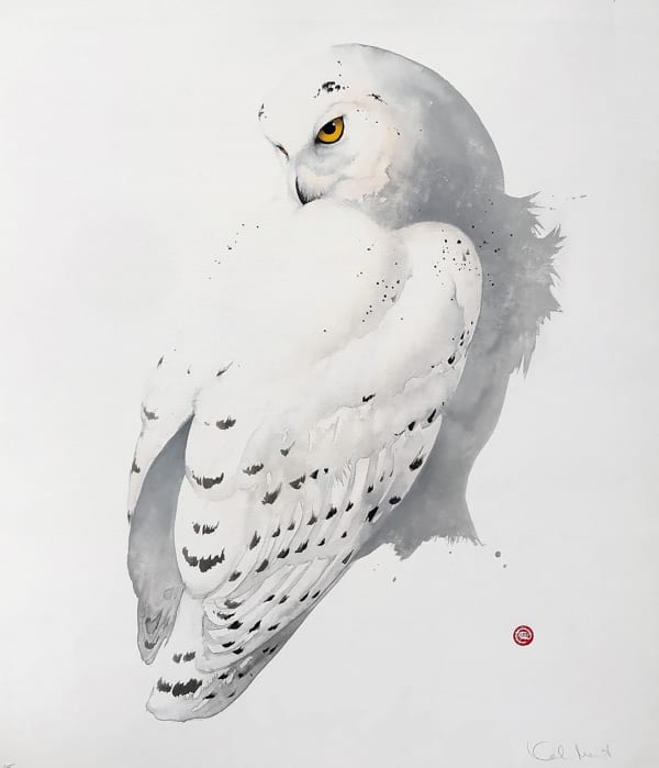
The first step of the lithography process consists of creating a base image. I do this by painting my image on the matte surface of an acetate film - only using black, regardless of the colour of the finished bird. I mostly use gouache, but crayon, pencil, ink or watercolour work as well. The first film is thus a black and white rendering of the bird that is going to be depicted in the lithograph. I use my Asian brushes, salt, and most often lots of water, just as in my painting. I paint this first image as quickly as I paint a watercolour image. And the result is often as unexpected as in a watercolour painting, as I try to paint from “emptiness” here as well. The black gouache also dries in very unexpected ways, just as watercolour does. And as usual, the more I can let go of control the more free and more satisfactory the image becomes.
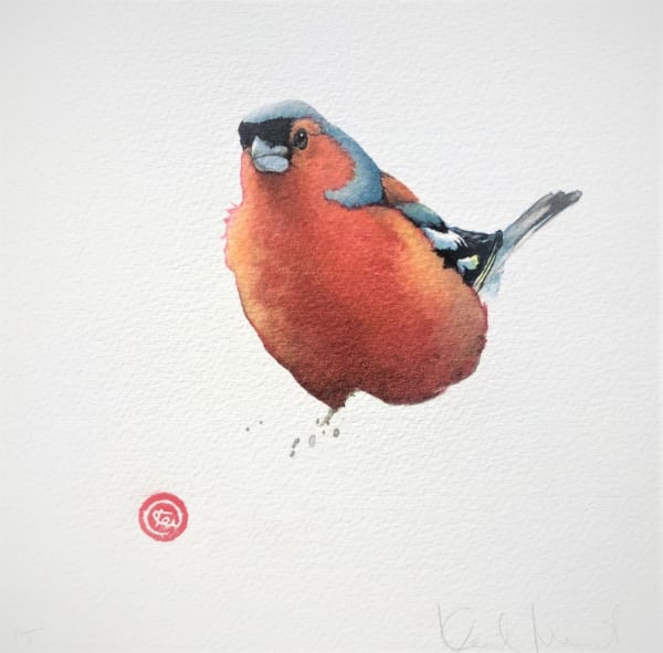
“Just like in my painting, I leave the face of the bird until the end, then having to adjust it to my “mistakes”. This gives rise to many unexpected personalities in the attitudes of the the birds. ”
After that, I have to try to decide if the image is to be dark or light, bright or neutral and in that case which colours have to be painted in order to achieve the image I have in mind. The odd thing with painting these films is that even if the colour I intend to achieve is light, for example yellow, the film has to be painted intensely black. And or very colour to be printed - in fact, every nuance of colour to be printed - a new film has ti be created which fits the shape of the bird on the initial film. Some films cover the whole bird, while others include just small details that require a different colour. I also have to “stay within the lines” of the birds contour, which demands an intellectual, focused attitude towards the image. There are few surprises, but at the same time, given that everything still is black and white, I actually have no idea what the outcome will look like.